
Listen to this article:
 |
Every company is a data company. Corporations rely on sourcing, managing and manipulating data to understand their products, customers, and employees. As data collection services become more detailed and integrated into everyday applications, visualization is crucial to separate important data from nonsense, identify causal and cor-relational relationships, and ultimately, tell a story.
In this post, we’ll explore visualizing employee location data from Workday, a rapidly growing financial data and human capital management platform, with the Google Cloud Platform (GCP) RESTful data service BigQuery, and Data Studio, Google Marketing Platform’s data reporting service.
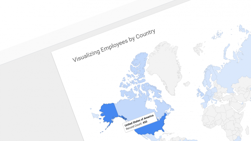
Here’s an example of what we’ll build. (Hover to interact):
Workday + BigQuery + Data Studio
Workday is an on-demand, cloud-based human capital management application that intuitively provides both small business and large corporations with complete visibility over finance and human resources data. The platform harnesses Reporting-as-a-Service (RaaS) to deliver employee data to third party services in various file formats including CSV, JSON and XML. CSV and JSON formats are especially powerful for RESTful data mining.

BigQuery is GCP’s fully-managed RESTful data service with built-in machine learning to analyze large datasets in conjunction with Cloud Storage and Cloud Datastore. Data can be loaded into BigQuery in either Avro, Parquet, ORC, JSON, or CSV formats.
Data Studio is a data visualization and reporting tool from Google Marketing Platform. While it can seamlessly report data from Google Analytics, the service can connect with over 112 sources including BigQuery, Cloud Spanner, Cloud SQL, Google Sheets and locally stored CSV files. Data Studio uses a what-you-see-is-what-you-get (WYSIWYG) interface to build reporting pages and visualizations, and the final documents can be shared internally or embedded into public web-pages.
Workday to BigQuery
To collect and deliver data to BigQuery from Workday, we’ll simply download a CSV file from a newly created RaaS with employee names and their location (country). The CSV file will then be uploaded to BigQuery with the following python 3.6 script:
from google.cloud import bigquery
client = bigquery.Client()
filename = '/path/to/file.csv'
dataset_id = 'my_dataset'
table_id = 'my_table'

dataset_ref = client.dataset(dataset_id)
table_ref = dataset_ref.table(table_id)
job_config = bigquery.LoadJobConfig()
job_config.source_format = bigquery.SourceFormat.CSV
job_config.skip_leading_rows = 1
job_config.autodetect = True

with open(filename, 'rb') as source_file:
    job = client.load_table_from_file(
        source_file,
        table_ref,
        location='US',  # Must match the destination dataset location.
        job_config=job_config)  # API request

job.result()  # Waits for table load to complete.

print('Loaded {} rows into {}:{}.'.format(
    job.output_rows, dataset_id, table_id))
You could improve this script to include a function that downloads the CSV file from Workday, but that will require authentication with a username and password.
Adding BigQuery to Data Studio
Creating and sharing reports in Google Data Studio is free (for now). To signup and access the service, simply visit https://datastudio.google.com and click USE IT FOR FREE. Once you’ve created an account, you’ll need to connect to your BigQuery project.
In the left navigation bar, click Data Sources, and then the “+” button on the bottom right corner.

Select BigQuery, and then follow the menu items to select your Project Name, Dataset, and Table. Finally click the Connect button on the top right corner when done.

Now we’ll quickly build a reporting page with two visualizations, a Geo map to show our employee locations, and a table that makes our CSV data comprehensible.
Visualizing with Data Studio
In your Data Studio portal, start a new blank report by selecting it from the top menu.

On the next screen, you’ll be prompted to select a data source. Select the BigQuery source that you just imported into Data Studio. Once you’re in the editor interface, feel free to give your report a meaningful name. For example, you could call it Visualizing Employees by Country.
To add a title block to your report page, you can use a text box. Click the text box icon in the top bar to draw a text box. Use the properties that appear on the right to change font size, colour and type as needed.

To add a Geo Map that showcases your employees over a world map, click the globe icon and draw it on your report page.

Data Studio should have identified country locations from your BigQuery data automatically, but if you’d like to manually select the right column to visualize, you can use the Data tab on the right and add columns to the Dimension property. Use the Style tab to modify your map’s appearance.

To make your CSV file comprehensible, you can use a table. Click the table icon and draw a table below the map.

Similar to the Geo Map, you can change the columns shown in the table by using the right properties bar.
To share or embed your report on a web-page, locate File > Embed report in the main menu and copy the iframe script to any HTML web-page.

And that’s it! You’ve just downloaded employee location data from Workday, uploaded it to Google BigQuery, and used Google Data Studio to visualize the data in an interactive map.
Geoffrey Momin is an Engineer and Technology Consultant. He is actively researching the application of blockchain, artificial intelligence and conversational interfaces to improve human capital and enterprise management.